This week has been a mass of various thoughts and reviews of the first baseball card release for 2016, the Topps traditional flagship series 1 release. I made a decision not to bother with this release, but I decided to play 1 $25 scratch ticket, that being in the form of 1 retail blaster box and 1 jumbo rack pack.
So the two current golden boys of baseball have been given proper marketing with reigning National League MVP the product cover boy, and Mike Trout taking the honorary card #1. The blaster box includes 1 pack that contains a "gold medallion" card, as well as 10 standard packs.
This years set includes 5 different parallel versions of the set. Rainbow Foil (1:10), Gold (1:14), Vintage Stock (1:270), Pink (1:535), and Platinum (1:26,699) Not to mention the base set includes 2 variations the now traditional "short print" (1:125), and the "SUPER short print" (1:1,247) Of course there is a litany of insert sets MLB Debut (1;2), Berger's Best (1:4), Perspectives (1:4), The Greatest Streaks (1:4), 100 Years of Wrigley Field (1:8), Walk Off Wins (1:8), Back-to-Back (1;8), Pressed into Service (1:8), First Pitch (1:8), 2016 Presidential Candidates (1:12), Bunt Code Card (1:19), and Bunt Player Card (1:3,741) Topps certainly wanted to make their release something collectors will chew up for the next couple months before their premium releases. So here is how I fared with my blaster box. My first card of the year was....

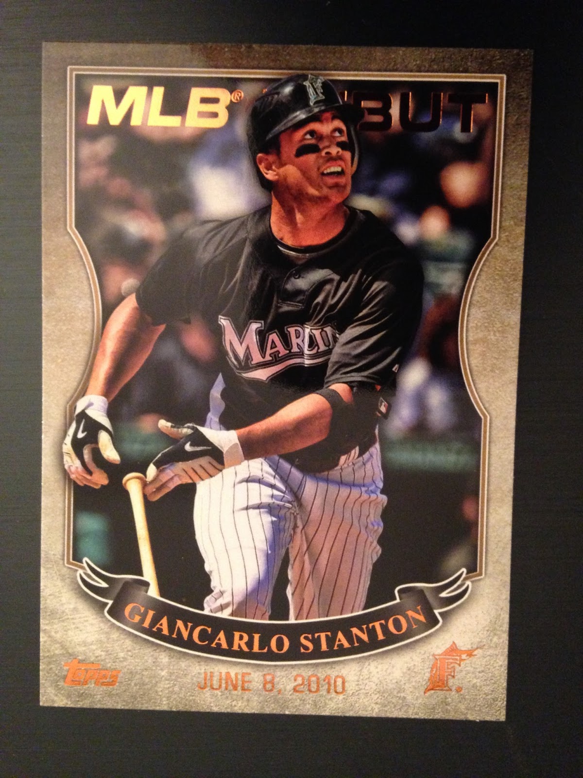
Giancarlo Stanton! Not a bad first card The one thing that stands out with this years design is how processed the cards look. It is like they sent these photos to a graphic design school and told them to create and polish and use as many filters as possible. The photos border in illustrativeand the descision to go borderless on the set is not one I care for. This is the base product, the product that was release 65 years ago, and has been collected year, after year, after year. This line has been around long before the Stadium Clubs, Finests, revamped Bowman, and the other various lines Topps produces, and I feel this should be one of the truly traditional ones including their design, so I would like to see borders and clean photos. The name plate looks like a drop from a television broadcast, and I am not necessarily 100% against this design, even with the sponged look of the color within the bar, but I really do not like the "logo stripe." I do not care for the way they render the logo somewhat "unreadable." I know that they feel the buyer is familiar with the team logos enough that they will even recognize even a portion of the logo, but I feel that the logo is heritage of each team, and it should be clearly viewed and respected. It also seems that the designer did not know what to do with the lower corner space, so they just added lines, To ensure the team name is legible, the designers decided to blur and erase the photo creating a faded look with the image in opposite corners. - I don't get it? If you are going borderless, then would the photo not bleed? Why go through all this trouble when you can just add a border? Did the designers think that it would look cool that all the players played in a low lying fog? Sorry Topps, I think you overworked this product.
So what else did pack #1 unveil?
I guess this would be what they call their "rainbow foil" - It is certainly foil, but rainbow? I was not sure and only identified it because it is the only parallel that is not serial numbered.
Needless to say, the drop rate of 1;2 for the MLB Debut insert played true as I pulled this Pujols card. The design is nothing extrodinary, and looks like so many other subsets/inserts we have seen for many years. The 1996 Upper Deck Predictor set comes to mind when looking at this design.
Here are the rest of the cards from pack #1 Nothing too exciting, though I still find the acknowledgement of the WHIP statistic with a WHIP leader card a bit funny, seems to be very fantasy baseball oriented. I just like tradition, and would have been happy with Win, ERA, K, and Fireman leader cards like they have been doing for over a half century.
I will admit, this is a cool shot. Though the typeface looks like something out of a "Baseball Tonight" graphic. I can literally see the words "perspective" and "Ryan Braun" moving on the screen. The actual shot itself is excellent. This is certainly the best insert of the set and will be in high demand. Fortunately, the seeding of 1:4 makes it a set that will be plentiful.
This next insert is from the "First Pitch" collection. Honestly, I had no idea who this awkward bean was and had to look him up. Come to find out it is a future NBA bust. This shot makes Porzingis look like he throws like an nonathletic girl. Perhaps he threw a perfect pitch to the cathcer, I don't know, and I don't care, but from this shot, it looks like he will throw it like a two year old and shout in a broken English accent "Ball go far!!" (Okay, I am being a dick, but generally, I say a lot of nice things about people in my write ups.)


The other card in this pack was this propaganda piece from Topps. Here I am asked to "Rediscover" their product. Well, considering I have been away from the hobby for quite a bit, I guess I am rediscovering it, and just like when my cats turn in their litter box and "discover" what they left behind, I want to quickly cover this in sand. This card hits all the current social media nomenclatures, give your Facebook links, Twitter handles, web addresses, all the current business card offerings. Speaking of offerings, I am rewarded with a $0.50 discount for any of their products for the upcoming year. I plan to buy Heritage for sure, so I guess I can expect to pay $79.50 for a box rather than $80. Sweet 1/2 percent discount!! Thanks Topps! Who am I kidding, I will constantly forget this card and never even redeem it, only finding it after it expires.
The rest of pack #2. The Matt Holliday horizontal card is a nice shot, and it appears Alex Gordon agrees as he looks up to check it out,
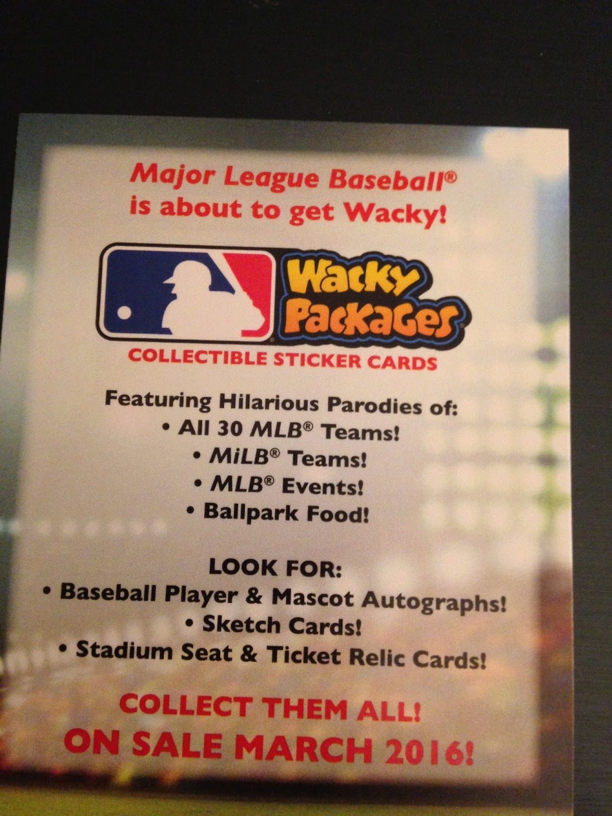
This card is one of Topp's promotional efforts to revive their "Wacky Package" sticker line. For anyone that is not familiar with Wacky Packages, these were cartoon style cards of familiar products that are parodied in some rather silly or disgusting manner. The artwork was great, and they were always fun cards to get as a kid. I am not sure how I feel about these. Part of me likes that they are bringing them back, and this card certainly represents the style and spirit of the old Wacky Packages, but the fact that Topps is trying to insert the now standard marketing of "autographs" or "relics" to the cards makes my eyes roll a bit. I guess I will reserve my thoughts until I see the actual product.

This is one of the "Greatest Streak" insert cards. The card certainly follows the feel of the set with the ESPN bumper style typeface, and the bleeding the image borders. The photo again looks more illustrative than actual photography. The background looks like the wake of a starship that just hit warp speed.
The rest of pack #3
My one "100 Years of Wrigley Field" cards. Sadly, I got Mark Prior rather than a Maddux or Ernie Banks card. This is probably the second best set behind "Perspectives" The use of the brick and ivy is a no brainer, and modifying the Wrigley Field sign to showcase the theme of the set is excellent. If I were a Cubs fan, collecting this set would be high on the 2016 agenda. I would like to see some of the other cards in the set. The night shot of this card mutes the ivy on the card.
Time for the reprint cards. These are part of the "Berger's Best" insert set. So I guess that means glossy coated versions of 1960s and 70s star cards. Meh.
The rest of pack #4. Two standout cards are the Grandy and the Ben Revere cards. Both cards are great shots. The Revere shot is really cool and I think would have been a candidate for the "Perspectives" set except that Revere is not a big enough name for that set, so they settled to include it as his base card. Revere will never have a more brilliant looking card. The Granderson card is also tremendous, a great leaping catch shot and one of the better vertical cards in this collection.
My first "Back to Back" insert. I always liked Edgar, and I think he is a Hall of Famer, but I doubt the media will allow him enshrinement. Junior was pretty good too. The pixelated dissolve in the middle seems like they had no idea how to solve blending the two players together. I would think they would have had numerous shots of the two players together that they could have used rather than force the images together in this crappy method. This design has a late 80s Fleer feel to it.
Another MLB Debut card and still looking the bastard child of 96 Upper Deck Predictor and an Gypsy Queen card.
The rest of pack #5 - The Puig card makes me wonder if he actually catches the ball or if it drops. The look on his face is not reassuring. Future Star Kole Calhoun seems a bit of a reach, but I guess you have to pimp somebody. Calhoun had a strong debut, but he regressed last year, and I see him more like Marty Cordova.
My next "Perspectives" card is Jung Ho Kang leaping over Kolton Wong. Part of me wishes they photoshopped old Royals second baseman, Frank White in the shot, then when you pick your favorite you can say any answer would be "White" or "Wong."
My first insert from the "Walk Off Wins" insert set, of former Red and current ChiSox third baseman, Todd Frazier. This card would bewilder Forrest Gump,. ("Todd Frazier, you are missing your legs!!!") Pretty bland insert set IMO.
The rest of pack #6 and it is becoming apparent the horizontal shots out class the vertical shots by miles. Kaleb Cowart looks like he is wearing David Bowie's pants from "Labyrinth."
Two more inserts one of a great pitcher, and one of a pitcher that could have been great. Despite Gooden's flameout, I still really want copies of his 1984 Topps Traded and 1984 Fleer Update cards. They were so pricey and unattainable as a kid, that I feel like I really want to get them now that they do not cost that much. When Doc was on, he was incredible.
Another parallel, this time a "gold" variant of Russell Martin. Not a fan of how they laid on the gold in the grate look, but at least you know it is gold as Topps has had points where you could not distinguish what type of parallel a card was. This one is also numbered on the back to 2016 (Naturally) I wonder how many people attempt to put full sets of these parallels together?

The rest of pack #7 - Kaleb Cowart looks like he stole David Bowie's pants from "Labyrinth."
More inserts, an interesting choice with Josh Hamilton as his off field
problems have tarnished his career as well as his cardboard interests.
A nice card theme with the "Pressed into Service" of position players
that had to pitch. I wish they expanded it to players manning a
position you would never think to find them, such as the time Kirby
Puckett played second base.
The rest of pack #8 - The Nick Hundley card looks like he
is receiving a soft underhand lob from that beanstalk basketball player
from earlier.
"Agent Carter" Haley Atwell throws a first pitch during a cold April game at Kansas City. Based on that form, she looks like she did a 200% better job than the human light pole. Bernie Williams rounds the bases in his Tyler Durden cosplay costume. look at those glasses!! The first rule of MLB Debut set, is we don't talk about MLB Debut set!!
The rest of pack #9 - The checklist card with Papi and Pujols looks like Pujols is looking for a simple handshake, but Papi is about to give him the 5 minute version with 62 different types of shakes and grips.
Another "Perspective" card, this time of Robinson Cano walking through the dugout wondering why he ever left New York for Seattle. A nice pull of The Babe and one of his milestone records.
The rest of pack #10 -
The ten acks offered nothing extraordinary, the inserts came at the standard seeding. No great hit, but there would not be great hits if you got one in every box, so onto the bonus pack with the gold medallion card, and the pull was.....
Again, nothing major. The medallion looks plastic, and the card is really thick. Myabe I can recoup some of my money on these boxes by tossing them on eBay while the product is fresh and people are scrambling to acquire cards from the series.
The final open was the jumbo pack which offered a lot of duplication. Card came in 3-4 card runs that I had seen in the blaster box. THe inserts were:
Another card from a set that will not be discussed. (See rule #1) A First Pitch card of a U.S. Women's Soccer player who looks remarkably like Mickey Mantle. A Back to Back insert and my first Kris Bryant card, believe it or not. That is right, aside from this card, I don't own a single Kris Bryant card!!! A sick Cutch "Perspectives" card. I really like back shots if they are pulled off effectively, and this one is in that wheelhouse!!!
Here are the great horizontal cards from the series, just emphasizing how strong they are compared to eh base vertical cards. Topps really should have done all the cards in this format.
So I will say that the experience of ripping this blaster and jumbo was rather underwhelming, and that is not a bad thing, as it just affirmed my intent NOT to bother with this set. Maybe I will grab a single card or two of a player that ends up on my 2016 fantasy baseball team, but other than that, I will just flip what I can and send out the rest to collectors that can use the cards. I give this set a C- with the Perspectives and 100 Years of Wrigley the only saving graces from a lower mark.


No comments:
Post a Comment